Symbo Insurance
This project is a part of my graduation project, which is like a capstone project, carried out in the last semester of the academic year for all the design students to implement all the learnings learnt in the curriculum and accomplish a desired outcome/solution.
Due to its involvement with the industry, entire details of this project cannot be documented. To have a view of the whole project please get in touch raogauri19@gmail.com

PROJECT TIMEINE
Research- 6 weeks
Designing Work- 12 weeks
(This project has been completed
in 5 months of duration)
INDUSTRY PARTNER
The Design Trip, Design Studio
Pune
ROLE
Graphic Designer
MENTOR FOR THE PROJECT
Abhrojit Boral
TOOLS
Adobe Illustrator, InDesign & Photoshop, Figma
ABOUT THE COMPANY
Symbo Insurance is a multinational company, based in Mumbai and Singapore. Symbo’s vision is creating innovative insurance products for customer needs and shifting the insurance discussion from “selling what we have” to “creating what the customer needs”. Something which is easily available, at any time, any place.
Symbo is a preferred distribution solution for Insurers, Brokers, Agents and Brands. They offer insurance distribution capabilities with configurable platforms and market leading expertise, to connect the dots with our technology enabled services. They differentiate in removing manual intervention in the insurance journey based on the strength of our technology solutions. Symbo has technology solutions for each stage of customer journey including consulting, product fitment/innovation, buying and most importantly claims processing.
ABOUT THE PROJECT- INDUSTRY PROJECT
The document is an amalgamation of 1. Brand Refresh & Promotional 2. Publication Design 3. Interaction Design.
The project initially started with an understanding of the company and its business. As I began researching about the competitors, the integration of insurance, interviews of the users, ideation process, creating a new identity, it set up a foundation for the visual design. Along with the brand refresh it includes marketing & promotional collaterals, brochure design for the company's services, and revamping the current website.
RESEARCH
As research being the first step towards this project, it was crucial to study about the company, it’s business, workings, and connects people around the world. A mixture of primary and secondary research, including ice- breaking questions, mindmaps, research direction, rebranding vs brand refresh, interviews, surveys, empathy mapping, customer journey, hueristic analysis, SWOT, competitor analysis, brand positioning, business report model. The research covers a thorough analysis of the company and its target audience.


INTERVIEWS & SURVEYS
Interviews are essential and effective for qualitative research: It helped me to understand and analyse opinions, behavior, experiences, phenomenon of the audience. Open-ended questions for Interviewing helped me gain insights. To understand users closely, I even conducted some interviews in person and via video call- group ranging between 21-45 years.
To reach wider audience of various spectrum, I also initiated a Instagram Q/A(seeking benefits from the growing tech platform for research).
Additionally, user surveys are simple and cost-efficient means of gathering information from the target group. Survey research was used to assess thoughts, opinions and feelings. Surveys can be specific and limited, or they can have more global, widespread goals. User surveys did aid in identifying what it is that’s making the potential group feel or experience.

CUSTOMER JOURNEY
Using a customer journey map to analyze user behavior (in reference to travel insurance) helped me to understand a customer's travel experience through start to end and how they feel during their time at the location of travel. This approach provides two major benefits: It allows decision-makers to stay focused on customers.
Customer journey mapping is a way to visualize the customer experience and how they interact with your business. Your goal in mapping that journey is to remove the obstacles and make the process efficient and intuitive. The more seamless an experience you can create, the better the customer experience will be.

SWOT AND COMPETITOR ANALYSIS
Defining Strength, Weakness, Opportunities and Threats helped me to understand where the company stands in present , but also to devise a successful strategy for the future.
Similarly, I carried out competitor analysis for 8 indirect and 5 direct competitors of Symbo Insurance, where information about each company, their identity, vision and mission, and the plans/policies they offer were compared and studied in detail.
REBRADNING VS BRAND REFRESH
After jotting down the research directions and all the relevant data , I studied what is the basic difference between rebranding and brand refresh. Rebranding/Brand refresh it all sounds the same doesn’t it? Two people on the outside of the design world looking in it’s easy to get confused with these two terms as they go hand in hand. While a brand refresh keeps the company’s main brand identity and strategy intact, rebranding allows the brand to scrap their current identity and start with a fresh slate. Rebranding is a great strategy for companies that feel though their brand strategy is unclear or ineffective. Since this is a top-to-bottom change, this approach includes creating a new brand strategy, redefining the mission, reestablishing the brand story, and reworking the brand positioning and values to match a new, clear set of goals.
A brand refresh is ideal for a company like Symbo Insurance that already has a solid brand strategy, story, and philosophy. In a brand refresh, the idea behind a company’s main brand messaging usually remains quite consistent. Since the company’s long-standing presence in the market has already established brand equity, it’s important for the refresh to build on the brand’s existing reputation and enhance the brand equity that currently stands.
A fresh brand will reflect a fresh, current and up-to-date image of a company. This is reassuring to its existing customers and attractive to new one. As businesses grow and change, it’s important for their brands to reflect the current marketplace. If you stayed the same while all the companies in your industry changed, adopted fresher logos, and newer ways of communicating with their audience, then you’d end up losing your competitive edge. Just look at how Microsoft has changed its image over the years, whilst its core values remain the same, its brand has to evolve to stay as a market leader and embody current trends.
BRAND POSITIONING
How is it defined?
Brand positioning has been defined by Kotler as “the act of designing the company’s offering and image to occupy a distinctive place in the mind of the target market”. In other words, brand positioning describes how a brand is different from its competitors and where, or how, it sits in customers’ minds.

IDEATION
Here are some ideations for logos. I initially started with few keywords and brainstormed with different logo identities. I further explored some typefaces and wordmarks for the same. After a mentor session with my professor, we unanimously decided to go only with the logomark for identity, as the company had no strong establishment. Here are some ideations to specifically create a unique character in the logo. I came up with letter “m” as to have the unique charaterictics within the logomark. The identity symbolises uniqueness, modernity, desire and trust.
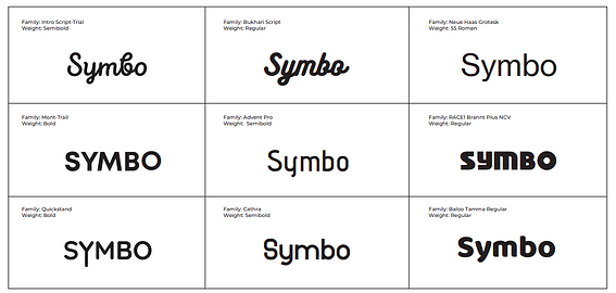
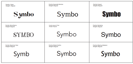
Testing and exploring different typefaces
LOGO CONSTRUCTION


LOGO EVOLUTION


Evolution of Symbo Logo from 2018-2022 begins from the first logo, second logo as shown, to the new one designed.
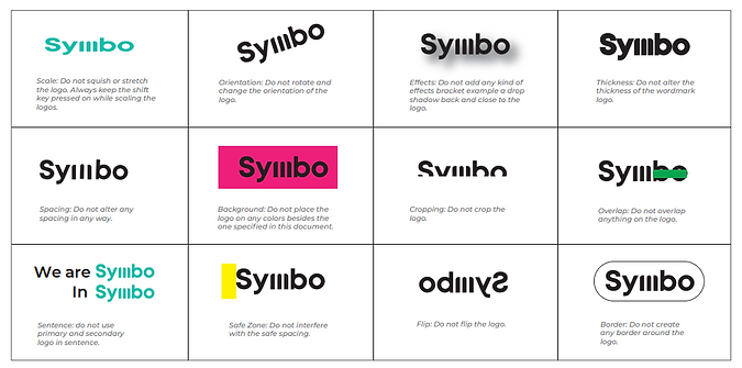
LOGO MISSUSE

COLOURS

LOGO BACKGROUND

B/W Background logo variations

Primary, Secondary and Tertiary colours- Background logo variations
TYPOGRAPHY
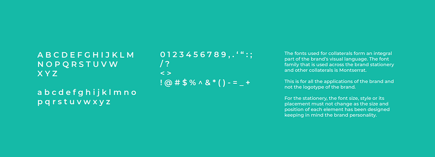
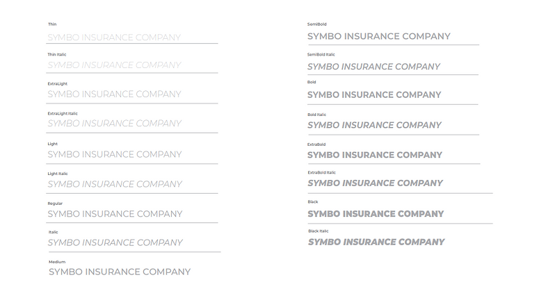
I have selected san serif typeface for all the collaterals and body type because of its clear geometric characteristics., distinctive readablility even in small sizes. Montserrat is a geometric sans-serif typeface designed by Julieta Ulanovsky. It is very versatile and can be used in multiple domains such as websites, the publishing world, branding, editorial, logos, print, posters, etc.
It is a typeface that can be used basically anywhere because of the geometric and elegant simplicity with nice large x-height. Montserrat really shines for short pieces of all caps and the geometric simplicity of the letters. In lowercase, it is still a pretty nice font with a nice large x-height and is rather close in spirit to Gotham and Proxima Nova, but has its own individual appearance- more informal, less extended and more idiosyncatic. It is basically the one that suits all and creates feeling of trust.



SCALE

SPONSER LOGO
In case the symbo logo appears with a sponsor logo, a minimum distance of 12mm of the space should be maintained from the sponsor logo. The same distance should ideally be kept between all the sponsor logos.

COLLATERALS
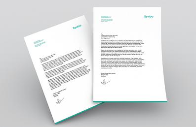
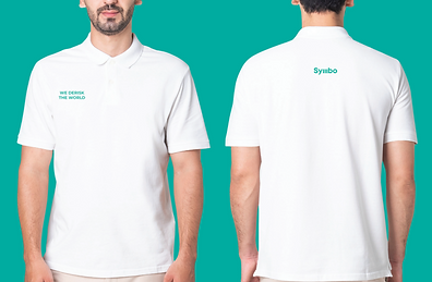
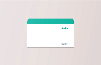
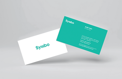
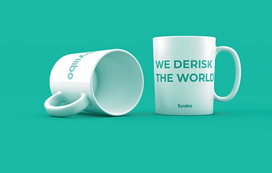
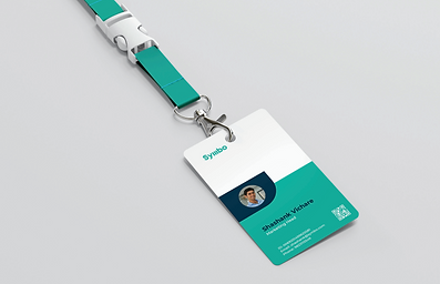
Marketing and Promotional purpose, here are some collaterals. Products like clothing, mugs can be appealing for the internal staff to make purposeful and trustworthy statement. Stationery like letterhead, envelope, employee card are some of the examples added to the list.
PUBLICATION DESIGN
Why Brochure? A well-designed brochure serves as a perfect introduction to any business. Accurately distributed, brochures can expand your company’s visibility. Brochures are great marketing tools when reaching out to new customers. It provides positive press about your company.
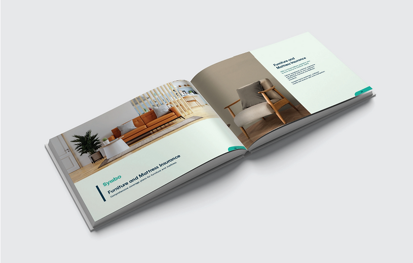
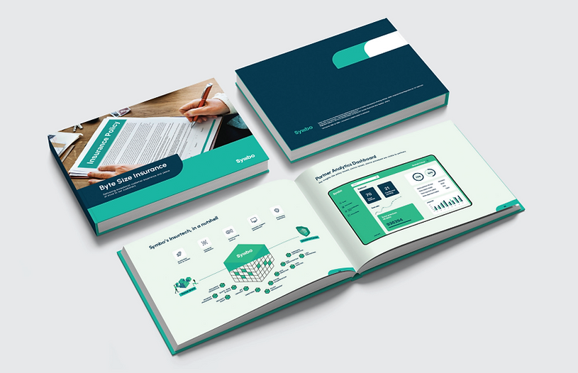
This brochure is designed for the company itself, as a record and a direct distibution for marketing agents, for all the new insurances launched by Symbo. The content in the brochure is a compilation of seven new insurances- Footwear Insurance, Pet Insurance, Jewellery Insurance, Cycle Insurance, Furniture and Mattress Insurance, Eyewear Insurance, Mom-To-Be Insurance. Here are some layouts which I tried for Symbo’s Informational Brochure. It includes all the unique insurances Symbo has designed and offers to sell to its desired users.

Trial prints of book layouts and confirming the structure for visuals/informational content.
COVER LAYOUT
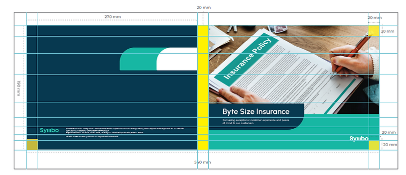
Back and Front cover design of the brochure. Measurements and layout defined in grids.
PAGE LAYOUTS
VISUAL ELEMENT
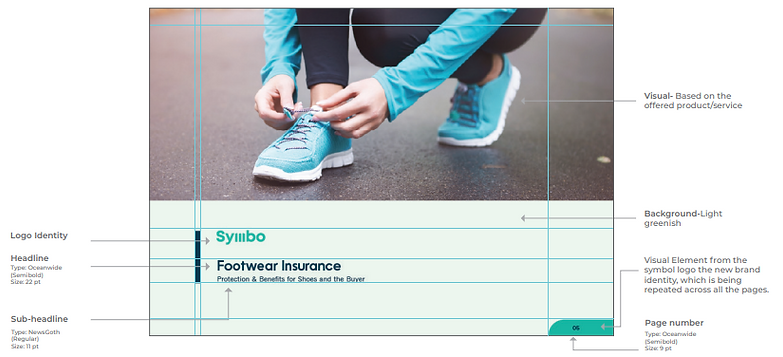
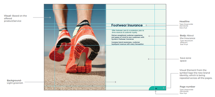
The shape is been used as a visual element in Symbo’s Visual Design. Introducing in brochure and other branding collaterals. In publication, it has been used for page number in the bottom right corner in turquoise and white colour.

The visual element can be only used within the given brand colors and guidelines.
BOOK
